and yet the Government is caught unawares?
Virus cuddly toys! The psychology of facing the fear


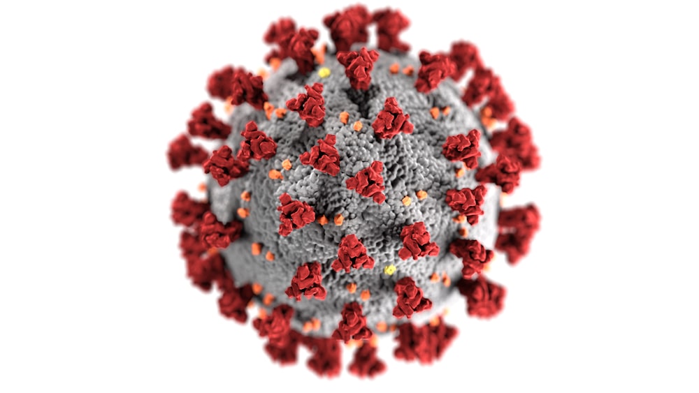


One ‘Kissing disease’ (Epstein-Barr virus) GIANTmicrobes® plush toy.
GIANTmicrobes® are stuffed toys that look like tiny cells, bacteria and viruses – only a million times actual size! They’re humourous, educational, and fun!
Have we been here before?
https://www.sciencedirect.com/science/article/pii/S1755436518300306
Contagion! The BBC Four Pandemic – The model behind the documentary
Under a Creative Commons license
open access
Keywords
Influenza dynamics
Fine-level spatial simulation
Human mobility
Contact data
Mobile phone data
1. Introduction
In a nationwide citizen science experiment, 360 Production, commissioned by the British Broadcasting Corporation (BBC), launched an app called BBC Pandemic that was available for download to smart-phones via App Store or Google Play. Using the app, the volunteers could participate in two studies: (1) one focusing on Haslemere, a town in Surrey, where there was a campaign to enroll a considerable number of people and volunteers’ mobile phone locations were simultaneously tracked with permission over three consecutive days, and (2) a bigger study for users across the United Kingdom that, with permission, recorded volunteers’ hourly locations to the nearest square kilometre over 24-h period chosen by the volunteer. At the end of each of the study periods volunteers were asked to input whom they encountered during that period. Here we focus exclusively on the national dataset, consisting of recorded movement data and self-reported contact data. We were tasked with using this data to develop a mathematical model for the spread of influenza, and thereby to simulate how a pandemic-like strain of influenza might spread through the United Kingdom. This virtual outbreak was to start in Haslemere, a town in Surrey, in the south of England, to follow the programme's narrative, with the documentary's presenter acting as a hypothetical index case. Detailed data from Haslemere formed the basis for an individual based model (detailed in the companion paper by Kissler et al., 2018b) used to simulate an outbreak in Haslemere that was to seed the virtual national outbreak.
To meet the tight production and filming deadlines, we had to make quick decisions, often responding to requested outputs and changes in under a day. The bulk of our work here took place in three weeks: starting from the maths team finishing modelling and filming for the previous part of the programme (the part on Haslemere outbreak Kissler et al., 2018b) and getting the main part of the data on which we could start to investigate and make decisions on the model for the national simulations. There were many challenges here, chiefly associated with working with very large datasets which have never been used before. We had no specification imposed on the model structure, indeed the detail of how it worked was not included in the programme, but we were aiming for an output that would give a detailed geographic picture of pandemic spread.
We were able to make extensive use of the new and very promising dataset to develop, parameterise and run a detailed national simulation, all in time for the required schedule. We are presenting in this document what we actually did, starting with building from the data, to the model construction, and resulting simulation outputs. With the luxury of even a few more weeks, we would certainly have investigated alternative approaches and explored robustness to model choices and parameters: we comment further on this in the discussion section.
All of the results presented here and in the TV Programme make use of the app data collected only up to October 30, 2017 (i.e. about a month's worth of data as the app launched on September 27, 2017). As we write this document, the app is still collecting data and will continue to do so during the rest of 2018, and the final dataset will be published with a separate paper (expected early 2019). Until then, the results from the datasets here should be treated as preliminary only. The app data consists of three interlinked data streams: (i) user profiles, (ii) location logs, and (iii) user encounter data. The user profiles gives us a brief information about the user, and the key thing used here is their age. The location logs give GPS position of the user (to square kilometre resolution, one record per hour) and we used this to extract detailed movement profiles. The self-reported encounter data gives a list of basic information on people they met in that day, and we use this to build age-structured contact matrices below. In total, the data used to shape the model comes from information contributed by 28,947 users.
2. Data analysis and preparation
2.1. BBC data – from location logs to movement patterns
2.1.1. Data extraction
From available location logs and user profiles data we create a single file with user characteristics (age, gender, max-distance-travelled), and location coordinates for each hour during a 24-h period starting with the time of the first location log. To calculate travel distances we take the first recorded location as a reference location, and calculate distance between reference and destination coordinates using Haversine distance with radius set to Earth's radius in Haslemere (R = 6,365,295 m). We are assuming that the reference location is usually ‘home’ or somewhere nearby, and we eliminate all entries whose reference location is not in the UK. To later run the model, we assign each reference location to one of 9370 model patches (defined in Section 2.3) using function over() from sp R-package.
2.1.2. Distance travelled – within 100 km
We abstracted from this data the (time-weighted) distribution of distance from reference location on the scale of kilometres. Distances were binned into one kilometre ranges (so 0–1000 m, 1000–2000 m, etc.). Then a tally was made of all of these, summing over all users and all recordings for each user. For this part of the analysis, we consider only distances up to 100 km and discard the rest (but see below for long distance jumps). This was all done separately for users whose home locations were within urban areas and for those within rural areas (shown in Fig. 1).

Fig. 1. Distribution of rural and urban mid-layer areas in the UK.
An interesting way to look at these counts was as cumulative density, in other words: what proportion of the time do users spend more than distance X away from home. Both the raw counts and the cumulative densities are shown in Fig. 2. From the cumulative density plots, it can be seen that the rural users typically spent more time far away from home.

Fig. 2. Distribution of distances from home for up to 100 km, split by rural and urban. (a) Total number of recording in distance bins of kilometre width. (b) Probability of being further than x metres away during a recoding, i.e. 1 – normalised sum of counts up to that distance.
To go from movement patterns accumulated from many individuals to the ‘right’ kernel in a gravity-like patch model is an important and interesting open question. We believe this warrants much further attention from researchers, as we move into an era where such data is becoming available (BBC Pandemic data will be widely available). Here, we were limited by availability of good methods, and not enough time to develop and test anything sophisticated. We took the best approach we could (described below), but we still feel this point deserves much further careful work.
The distribution of distances for our recordings gives a simple measure of how much time a user spends a given distance away from ‘home’. For our purposes, we were interested in transmission between model patches (typically several or many kilometres apart). The bulk of recordings are within 1000 m of home, plus the app resolution is only of the order of 1000 m. So to make a kernel for between-patch movement, we used only the values for over 1000 m away (effectively dropping the first bin count and replacing it with a duplicate of the second count to represent movement to very nearby other patches). Then the counts were normalised, to give a distribution of where people are, given they are away from home. At this point we have two lists of length 100 to give the proportion of time away from home that is spent at each kilometre binned distance. Denote these as Fu(i) for urban and Fr(i) and rural (for i = 1–100).
We also explored differences in movement patterns with respect to many other factors, including the participants’ age and gender, illustrated in Fig. 3. The difference by gender is interesting, particularly over the mid-range of distance, and deserves further attention, but we decided not to pursue it for inclusion in the model here. The split by age group is even more intriguing, especially given different age pattern observed in a smaller dataset of self-reported distances and contacts from southern China (Read et al., 2014), where elderly age groups appear to move the least. Again, we did not use this distribution directly here, but return to it in the discussion.

Fig. 3. Probability of being further than x metres away during a recoding, i.e. 1 – normalised sum of counts up to that distance, from home for up to 100 km, split by (a) age group, (b) gender.
2.1.3. Distance travelled – long jumps
A model based purely on density of movement from above would have transmission rates tailing off sharply over tens of kilometres. An epidemic simulation of the UK would be strongly wave-like, and jumps across the sea to Northern Ireland would be rare, and epidemic travel would be very slow indeed across less densely population regions (such as around the England–Scotland border). The epidemic would then effectively get stuck, politely waiting some time for infection to stochastically cross those boundaries. In reality, infection can occasionally ‘jump’ very long distances, and these rare events become important particularly across natural boundaries and low-density areas, so we wished to include this in our model.
One method to implement long range jumps, just to allow these rare events to happen sometimes, is to add a small uniform rate of infection jumping into a patch. A very simple assumption such as constant external seeding (e.g. Gog et al., 2014) might be appropriate when fitting such a model to data, but this is not ideal for a realistic forward simulation of an outbreak. Given the richness of the BBC pandemic data, we were able to explore and adopt a slightly more specific mechanism for long-distance transmission within the UK.
We looked at recordings where the reference and current locations were over 200 km apart (so users were more 200 km away from where they initiated the app). The origin and destination points are plotted in Fig. 4(a). Visually, these correspond well to the most densely populated parts of the UK, which are shown in Fig. 4(b). (Interestingly but not surprisingly, Dublin also very clearly appears as destination, but not as the origin as we removed the users who initiated the app outside of the UK).

Fig. 4. Population density and long jumps. (a) Latitude and longitude points of origin (blue) and destination (orange) of trips longer than 200 km. (b) Population density of UK on a log scale. (c) Map of hyper-connected mid-layer areas in the UK defined as the areas with the population density >10,000 persons per square kilometre. Grey lines designate the patch boundaries given by the mid-layer geography defined in Section 2.3. (For interpretation of the references to colour in this figure legend, the reader is referred to the web version of this article.)
Motivated by this, we picked out the most densely populated patches. A cut-off of population density over 10,000 people per square kilometre gave 336 patches (out of a total of 9370), corresponding to the top 4.4% most densely populated places, weighted by population numbers. These places are marked in Fig. 4(c). The majority of these places are in London. But, crucially, other major urban centres of the UK were also represented, including patches within Belfast, Edinburgh, Glasgow, Cardiff, Plymouth, and several in the major centres of the North West of England.
These patches were wired up to be connected to each other with a small trickle rate, that was chosen to be small enough that it did not shape the majority of transmission, but it gave a mechanism for the epidemic wave to ‘jump’ across the low-density natural barriers (such as the sea), and establish in major cities where it could then spread more locally to the rest of the region.
This clearly warrants further evaluation with the final dataset in future, together with exploration of the effect of alternative assumptions on simulated epidemics. An obvious criticism of what we have here is that many of the app recordings are in the major urban centres anyway, so we would have to control for this bias carefully in determining a structure for long-distance transmission events. This would matter more particularly if exploring the behaviour over many stochastic runs rather than needing a single plausible run. However, for this purpose, we just needed the general arrangement to allow long-distance jumps, and the approach described here is more realistic than a uniform seeding probability, and was possible to be developed and implemented in the time available.
2.2. Contact data to mixing matrices
2.2.1. Extraction of contact data
In the contact data part of the app, participants give the estimated age of each of their reported contacts, encounter location (work, home, school or other), encounter type (physical or conversational), and whether or not participant has spoken previously with the contact. On inspection, 37 participants were discarded from further analysis as their data appeared anomalous (extreme numbers of contacts, suspected repeated entries, etc.).
At the time of the BBC Pandemic filming and gathering of the initial data set, the app version had a slider for reporting the estimated age of the contact with default set to 50. The effect of the slider is that there is a clear excess of the contacts with reported age equal to 50. This will be fixed in a subsequent app update, and thus it will be possible to retrospectively investigate the extent of the effect once the data from a period after the update is available. Here we applied a quick workaround: We suspect that if users were going to enter someone with estimated age somewhere near 50, they will sometimes just leave the slider at 50, leading to an excess of reported contacts with the age of 50. We estimated the size of this excess by interpolating the number of contacts of neighbouring ages and redistributed the excess using a binomial distribution (shifted to age range 40–60 with p = 0.5).
We set up 15 age classes to be our age-structure units to work with in the model: 14 blocks of 5 years of age (0–4, 4–9, …) and single class for age 70 and over. Both the age of the participants and contacts (after the compensation for the slider default) were mapped to these classes, and the resulting counts give the raw contact matrix C = (Cij) where Cij is the number of encounters between participants of age group j and contacts of estimated age i. The total number of participants in each age class is pi. The raw contact matrix was normalised by these to give the mean contact matrix M = (Mij) where Mij = Cij/pj. We do this separately for conversational and physical contacts. Note that the first two columns of C are zero (j = 1 and j = 2) as we have no users in these age groups (see below) and the columns are left as zero in M.
2.2.2. Building age-structured transmission matrices
We continue from the mean contact matrix from the BBC data as above in the form Mij, and also bring in 2016 census population estimates (from ONS, 2017) to obtain UK age structure and the population vector ni, where i denotes which age group (i = 1, …, 15). The columns of Mij give the ‘average’ number of contacts of age i that users of age class j meet each day. Our underlying assumption is that this is representative of the population as a whole, and thus if we were to multiply that column by nj then we would have the absolute number of encounters each day between age group i and j.
Note that through age restriction of the app to age 13 years and over we have no users in groups 1 and 2 (age 0–4 and 5–9) and partial set of users in group 3 (age 10–14). The assumption that the 13 and 14 year olds are representative of the full group 10–14 is a limitation here, but we could see no fast and reliable way around this.
We fill in the full mixing matrix for the modeling work as follows. Built a ‘transpose’ matrix to get the average number of contacts for user of age class i to contact of age class j: Tij = Mjini/nj. This now has data in rows 3–15. Take the average of M and T, but carefully: Where we have both entries, take mean of M and T. Where we have one or other entry, just take whichever is present (M or T). This leaves an empty two by two block.
Again, this is done separately for conversational and physical contacts, and in each case leaves and empty two by two block for the mixing between the youngest age classes. For physical contacts, our matrix looks to be comparable with the corresponding POLYMOD matrix (Mossong et al., 2008). For conversational contacts, our matrix looks to be about a factor of 5 larger than POLYMOD (Mossong et al., 2008). We will need to do further work to identify exactly why this might be, but candidates include slightly different question approach, a more social group participating in the app-based study and the number of reported contacts being limited in a paper-based study. We required a single matrix to use in the age-structure model below. Motivated by the comparisons above, we took a decision to use a matrix that is BBC physical plus one fifth of BBC conversational. This still leaves the two by two gap, and we decided to pad with POLYMOD values (Table S5 from Mossong et al., 2008, using the first1 two matrices for all contacts and for physical contacts).
The output from this section is a matrix whose jth column is to be interpreted as mean number of contacts for those of age j. We call this B = (Bij) (B for BBC).
A graphic representation of this matrix is shown in Fig. 5. This shows a classic tri-diagonal pattern. The strong diagonal stripe, particularly among the younger age groups (e.g. 15–20), showing that most age groups mix strongly with their own or nearby age groups. The clear off-diagonal stripes are likely to be generated by interactions between parents and their children. There is also a blur of interactions between the broadly working-age groups, where many age groups mix in a working environment.

Fig. 5. Representation of matrix B with darker shade indicating more contacts. (For interpretation of the references to colour in this figure legend, the reader is referred to the web version of this article.)
Clearly many of the decisions here are somewhat ad hoc and not ideal or fully explored and tested, and forced by needing a solution in a very short space of time. However, the result is a matrix which has clear structure, and not much visual noise. Note that as our age classes are not of equal population size the resulting matrix B is not symmetric (Fig. 5). Indeed as the oldest age class is largest, the bottom row is larger than the last column.
2.3. Geography of the UK: choice of ‘patches’
To build the UK model, we needed to decide on a spatial resolution that is fine enough to include the underlying heterogeneity in population density in rural and urban areas in the UK, but that is not too detailed to preclude us from running simulations relatively quickly. We used publicly available information on UK administrative geographies and demographic data from the 2011 census to create a realistic underlying structure for our model.
We created a mid-layer geography for UK consisting of 9370 patches, by unifying 3 different geographies: (i) Mid-layer Super Output Areas for England and Wales consisting of 7201 patches (available from ONS Geography Open Data, 2016); (ii) Scotland Intermediate Zone Boundaries with 1279 patches (available from Scottish Government Spatial Data Infrastructure, 2016); and (iii) Northern Ireland Super Output Areas consisting of 890 patches (available from Northern Ireland Statistic and Research Agency, 2014).
The shapefiles for different geographies were joined using QGIS 2.18. Census data from 2011 for each mid-layer was downloaded from ONS (Nomis, 2011) and matched to their respective geographies. We set the reference longitude and latitude for each mid-layer patch to the coordinates of their respective centroids found by using function gCentroid() from R-package rgeos. The area of each patch is extracted from the spatial polygon data given by the shapefiles, and used to calculate population densities.
For each mid-layer patch we assign rural or urban classification according to local government classifications of output areas, resulting in a rural–urban distribution shown in Fig. 1.
For England and Wales, we take the 2011 rural–urban classification of middle layer super output areas (ONS, 2016) consisting of eight levels (urban consisting of major conurbation, minor conurbation, city and town, and city and town in a sparse setting, and rural consisting of town and fringe, town and fringe in a sparse setting, village and dispersed, village and dispersed in a sparse setting) and reduce it to two levels: urban and rural.
For Scotland, rural–urban classification is not available for the mid-layer geography so we take the available 2-fold classification for the Output Areas (OAs) (Scottish Government, 2014) and map the OAs to InterZone areas. We classify the patch (InterZone layer) as urban if all OAs that fall within that InterZone are urban, otherwise we classify it as rural. This results in 854 urban and 425 rural areas.
For Northern Ireland we reduce the original 3-fold classification (Northern Ireland Statistic and Research Agency, 2016) (urban: population of 4500+, rural: 2250–4500, mixed urban/rural: under 2250) to two levels by redefining urban as areas with population over 4500 and rural as areas with population under 4500 (mixed urban/rural areas are re-assigned as rural under this classification).
3. Building the UK model
3.1. General model structure
To take best advantage of the available new data (described above) we chose a two-tiered model structure: within- and between-patches (where ‘patches’ are the 9370 geographic structures described above). The key idea here is that once the transmission chains have successfully established within a patch, the dynamics of the patch might as well be autonomous: occasional further imports of infection will do little to the local dynamics from then onwards.
In brief summary: the within-patch model is a discrete time SIR-style model with a realistic infectious profile, which implicitly includes an ‘exposed’ phase (so the model is essentially SEIR). Taking advantage of our new data, we use a full age-structured model. The between-patch model is a gravity-style model, with a stochastic implementation. The kernel used is more complex than most existing gravity-type models, again taking advantage of patterns of real movement gleaned from our dataset.
3.2. Within-patch model
The within-patch model is run once it is determined that a chain of infection has established within a patch (from the between-patch model). At this point, it can be run as an autonomous simulation, so in practice it is run separately from the between-patch and values are stored. The required outputs are (a) the force of infection and (b) incidence, both per day.
3.2.1. Discrete time
The core of the within-patch model is a discrete time (in days) SIR model. Ignoring age-structure (elaborated below), it would look like this:where S(t) are the remaining susceptibles (as a proportion of the population) at day t, I(t) gives the proportion who had infection starting on exactly day t and Λ(t) is the force of infection on day t. The dummy variable τ is used to represent how many days ago infection started, and β (τ) is the relative transmission coefficient corresponding to someone infected τ days ago.
Note that it would be more typical to include the R0, the basic reproduction ratio, in the coefficient β, but it is also common to include it in the age structured matrix below. To avoid the error of factoring it twice, we explicitly separate the factor R0, and instead remember to normalise both the β and age matrix to unity.
We use R0 = 1.8 as the basic scenario. A typical range explored for R0 for past pandemics, and for reasonable range for future pandemics is R0 = 1.4—2.0 (Ferguson et al., 2006). Here we choose R0 = 1.8 as a ‘quite transmissible’ pandemic, but not the extreme upper end. Note that the overall R0 in the national model will be approximately the within-patch R0: the probability that a single introduced infection in an otherwise susceptible country will directly infect other patches is extremely low.
To get the relative values of β (τ), we use the infectiousness information shown in Fig. SI8 from the Supplementary Information of Ferguson et al. (2006) to define and give our estimated values in Table 1.
Table 1. Numerical values of transmission rate per day of infection, estimated from Fig SI8 of Ferguson et al. (2006).
| τ | 1 | 2 | 3 | 4 | 5 |
|---|---|---|---|---|---|
| 0 | 1.6 | 0.8 | 0.2 | 0.2 |
To construct the β, the need to be normalised to give total 1, to make R0 correct for the model,
Note that on the day infection starts, there is no transmission, nor on the day after (β (1) = 0). The bulk of infection is on days 2 and 3 after each infection starts. There is a small continued transmission on days 4 and 5, and then that is the end of transmission. So, for this choice of β then we can set τmax = 5.
3.2.2. Age-structure
Starting from the discrete time model above, we incorporate the age-structure as follows. We model the population structure with 15 age classes, as described above in Section 2.2. Now, S(t) represents the proportion of those in age class i who are susceptible at day t, and similarly Ii. The general structure of the discrete SIR model extends easily:
Some care needs to be taken over the extension Λ, to being a rate that a single susceptible in class i will become infected (by any other class):
The matrix A (with entries Aij) is based on our data matrix B, which is described above. Recall, Bij gives the mean number of contacts of age i per day for someone of age j. This is almost what we want, but as our variables are proportions, we must scale up by the (infecting) population size of age class j (nj) and scale down by the (getting infected) population size of age class i (ni):
Finally, the matrix A must be normalised so that the model's R0 still works as intended. Its largest magnitude eigenvalue will be real and unique (by the Perron–Frobenius theorem). We rescale the entire matrix to make that eigenvalue equal to 1.
3.2.3. Initial conditions and outputs
The between-patch model already takes account of the possibility of stochastic fade-out soon after initial introduction. Thus the within-patch model is effectively conditioned on infection successfully establishing, meaning it can be run as an entirely deterministic model. We set the initial proportion infected as 1% of each age class, and distribute them equally as being in day 1–5 of their infection. For all age classes i:
This is clearly somewhat arbitrary, but all that is essential here is something to kick off the infection within patch such that it peaks in a sensible time period. For R0 = 1.8 and all other parameters as we used, the incidence within patch peaks at around three weeks.
Two key outputs are needed from the within-patch model: incidence and force of infection. Incidence, cumulative or instantaneous, is a matter of accounting using the variables above. For force of infection, take a total force of infection which comes from all age groups, while accounting for the transmission rates per day β(τ):
This generates a number that is proportional to the effective number of infected hosts in the patch, scaling using the realistic infectious profile. The exact value of the scaling is not important, as it is joined by other free factors in the between-patch model.
Note that there is no application of age-structured weighting (other than size of the age classes) here. The same one as built for within patch would not necessarily be applicable here. The ideal one needed here is related to encounter rate between age groups when one person is visiting another patch. It might be that it is possible to learn about the structure of this matrix from the full BBC pandemic data eventually, including how it might depend on distance between patches and so on, but for this purpose a flat weighting was used.
3.3. Between-patch model
The model for between-patch transmission is a stochastic gravity-like patch model. We have the 9370 patches as described above. Number them, and denote their population size Ni for patch i and the distance between patches i and j as dij (measured in metres).
The rate of a susceptible patch i having a successful infection chain initiated within it at time t is denoted by λi(t). This will depend on which other patches are currently infected, denote this set of indices as . Whether or not a patch is in the set of 336 with the highest population densities, which are wired up to give a tiny possibility of a long-range jump, is denoted with the indicator function Ji (=1 when in this set, =0 otherwise, so JiJj = 1 iff both i and j are in this set). The indicator-like function ru(i) returns ‘r’ or ‘u’ as appropriate for the rural/urban designation of the patch i.
Motivated by previous work on the spread between cities in the US in the 2009 pandemic (Gog et al., 2014; Kissler et al., 2018a), we use this form:
The dependence on population size is assumed to follow that of the 2009 pandemic in the US, and μ, the dependence of recipient population size, is set at 0.32 (Kissler et al., 2018a). The additional small rate for infection between densely populated places is set at ϵ = 0.5Fu(100) (outputs did not appear to be very sensitive to the value here, although not tested systematically, but this ballpark of being about half of the rate of two places 100km apart gave reasonable results). The ceiling function is used on distances to translate from real numbers to the indices used to abstract the movement data (where F(k) corresponds to distance from home in range 1000(k − 1) to 1000k metres.
The function ϕ is gives the linkage mechanism across the scales to the within-patch dynamics of potential infector patches. The time that patch j was infected is denoted τj, and so if then τj < t. The elapsed time since the local outbreak kicked off in patch j is then t − τj. So ϕ(t − τi) gives something proportional to the probability that a randomly chosen member of patch j is infectious at time t.
Finally, the overarching multiplicative constant ξ encompasses everything else that scales the rate of infection. This then implicitly includes frequency of travel from home, average duration of visit, a proportionality of rate of contact with people in the other patch: these factors are purely to do with movement so far, not the virus. The main virus factor here is transmission rate. However, rather than just factoring that in to determine if first transmission event happens or not, imagine that the non-virus factors and ϕ are scaled to correspond to one infected person being in our otherwise susceptible patch. Then we could use a classic branching theory result (which assumes that secondary infections are Poisson distributed) to give the probability, given a single initial infected, that a chain establishes successfully, which will depend on R0:
We could find no easy way to parameterise the remaining constant by comparing across other fitted systems. However, upon inspection of simulation output and comparison with typical time and speed scales, this constant was fixed at 22.5 (so ξ = 10 at R0 = 1.8). Given that it is pervasive in the force of infection, it might be feared that the dynamics are sensitive to this constant, however based on strategic simulations over a range of parameters (time-limitations precluded a formal sensitivity analysis) it does not seem to be so. A simple explanation is that the bulk of the transmission is driven by short range spread as each patch's internal epidemic spikes, so infection is very likely in that time interval, and scaling the total rate does little. As many other things, this needs further investigation. Crucially though, this factor was kept fixed when we explored additional scenarios, and only R0 changed (which also changed the within-patch dynamics).
All of this generates the forces of infection λi(t) for all the patches where infection has not yet established. For each of these, the probability of infection establishing during timestep t is given byand this is then ready to be implemented stochastically.
In the TV programme we first simulated a detailed outbreak in the town of Haslemere, and this was to be the seed of the national outbreak. We assumed that the Haslemere outbreak was somewhat underway, say two weeks in, before we effectively connected it to the national model, hence we set τ =−14 for Haslemere (time is measured in days), and all other patches start susceptible.
3.4. Additional scenarios
It takes about four to six months for the new vaccine to become available, once a new strain of influenza virus with pandemic potential is identified and isolated. As a part of the modelling exercise for the BBC programme we were asked to explore what control options could be easily implemented early in the outbreak before the vaccine is made available and to show graphically what the effect of such controls would be.
Hand hygiene is an important factor in influenza transmission and increased frequency of hand-washing is easily implemented. We assume that everyone complies with the frequent hand-washing for the duration of the outbreak. That is, in addition to their normal hand-washing, everyone washes their hands on additional 5–10 occasions every day throughout the outbreak, reducing the (local) force of infection by a factor r, and thus we replaced R0 with rR0.
We use the information in meta-analyses of hand hygiene and personal protective measures (Rabie and Curtis, 2006; Saunders-Hastings et al., 2017), to quantify the effect of frequent hand-washing, r. Given the data from the studies in the form:
| Control group | Intervention group | |
|---|---|---|
| Number of ILI cases | a | b |
| Number of no ILI | c | d |
The probability that someone in the control group gets infected during the outbreak is , and for someone from the intervention group (where λ here is the cumulative force of infection in the entire outbreak). We can therefore estimate r asLooking at the individual studies we selected the one with the highest quality of data (Godoy et al., 2012) and obtain the estimate r = 0.784. We apply this factor to give a modified R0 of 1.41: this is then applied both within- and between-patch to give an alternative simulation outcome.
There are other personal protective measures and basic hygiene measures individuals can undertake, including the use of hand sanitisers, hand hygiene motivated by influenza exposure (following contact with index case or with contaminated surfaces), or the use of face masks. We chose the frequent hand-washing as a measure that is easiest to implement and one for which we could find some reliable data. Our assumption of 100% compliance for the duration of the outbreak is clearly optimistic, however it may be that other very modest control measures could be put in place at the same time. On balance, a reduction in transmission of 22% is not unrealistically high, and a suitable scenario to present in the programme to illustrate graphically how fairly small adjustments could accumulate to dramatic total effect at the national level.
4. Results
The output of a single run can be summarised as the date at which each patch gets infected (or if it never gets infected in the time simulated). Fig. 6 shows the timing of arrival of the pandemic wave in the absence of control measures on the left, and with extra hand hygiene on the right.

Fig. 6. Geographic patterns of spread. Here, the disk area is proportional to geographic area of the patch to make it possible to see detail, but caution here as this is NOT the same as population density (many of the large disks are actually very sparsely populated areas). The colour is the week of arrival of the pandemic wave in rainbow order. The two parts (a) and (b) give the results for the simulation of the basic spread and for the modified case with reduction in R0, respectively. (For interpretation of the references to colour in this figure legend, the reader is referred to the web version of this article.)
Firstly, the general shape of the spread is clear: infection reaches London early on in both cases, and then it spreads through England and Wales, with longer range jumps initiating infection in Scotland and Northern Ireland. There is some finer structure though in both simulations which is more visible when zoomed in, in particular in the South East, as shown in Fig. 7.

Fig. 7. South East detail. This is the same as previous figure, but zoomed in to the South East and disks shrunk to make finer detail visible. (For interpretation of the references to colour in this figure legend, the reader is referred to the web version of this article.)
Regardless of the extra control measures, there are some patches which never become infected: these are mostly the large patches with very low population density in the North of Scotland, but there are also some relatively connected patches which just happen to escape infection (e.g. in Wales in both simulations).
The difference that the extra control measures make to the speed of the spread is striking. The simulation of the basic spread (no extra control measures) has most of the country being infected by around week 7, where as it takes to week 11–12 to achieve the same reach if the control measures are in place.
For both simulations, we can also look at the cumulative number of cases, as shown in Fig. 8. As the national spread has arrived in most places by week 7, it will then peak a few weeks later in even those later places, so the bulk of infection is concluded by 80–90 days: about three months. With the control measures, the accumulation of cases is dramatically slowed, and gets close to peak only around 140 days. As well as being slowed, the total number of cases is much lower.

Fig. 8. Cumulative cases (in millions) against time in days. For the basic spread in blue, and with extra control measures in gold. (For interpretation of the references to colour in this figure legend, the reader is referred to the web version of this article.)
The extra control measures do not stop this pandemic from spreading through the UK, but they do both slow it down and reduce its impact. This is in agreement with wider ideas of using non-pharmaceutical interventions to mitigate pandemics, explored in detail by Hollingsworth et al. (2011). Slowing down the outbreaks and reducing their impact are both extremely valuable. An extra month before many towns are reached could be enough time to allow further control measures to be rolled out, and certainly it would mean national resources (such as hospital beds) being less stretched by all places having epidemic peaks near-simultaneously, and generally be a much more manageable scenario.
The mortality rate was not explicitly included in the model, as it does not shape the overall spread of the pandemic or incidence numbers. However, the number of deaths can be deduced by a simple multiplication. The ‘reasonable worst case’ in the current UK pandemic planning modelling work puts the case fatality rates at 2.5% (Scientific Pandemic Influenza Advisory Committee, 2016) and many estimates of the mortality rate in the 1918 pandemic are in this ballpark, though this depends on which wave of the pandemic, which age group, which country and is notoriously hard to estimate (as neither the numerator nor denominator to any great accuracy) (Simonsen et al., 1998, Nishiura, 2010). Assuming here a devastating pandemic with 2% case fatality rate, the basic spread corresponds to 863,000 deaths. The number of these deaths that could be averted with control measures that reduce transmission by 22% is 260,000. Though extreme, this example serves to strikingly underline the value of basic hygiene measures: even without being able to avert the pandemic, there is clear potential for simple control measures to save very many lives.
5. Discussion
Here, we have presented a mathematical modelling analysis based on the volunteer data collected from the BBC Pandemic app, as an initial exploration of the data to generate potential scenario's of spread for the BBC documentary ‘Contagion! The BBC Four Pandemic’. This article is to document the science that underlies the visualisations in the television programme, and to highlight the promise that this dataset holds for improving future epidemic models.
As noted throughout the manuscript, this work was done under extreme time pressure, and could perhaps be seen to mimic the pressures when modelling an outbreak situation in real time. Real-time modelling was especially important during the recent 2013–2016 West African Ebola epidemic where it helped project near-future demand for hospital beds (Camacho et al., 2015; Funk et al., 2016), and helped design and evaluate Ebola vaccine trials (Camacho et al., 2017). Although we were similarly tasked with creating and parametrising a model on short notice, a major difference is that we did not have an incoming stream of case-data on which to parametrise the model, which ultimately leads to increasingly robust predictions and reduced uncertainty as the outbreak unfolds. Instead, here a single best model and the two simulation runs were required for illustration, rather than a range of simulations that explore the uncertainty of our predictions and their sensitivity to parameter values.
We attempted to make the transmission model as realistic as possible, but due to the programme narrative, some liberties were taken. In particular, we were asked to ensure that the epidemic was seeded in Haslemere. The simulated spread pattern across the UK therefore does not include any further international introductions. Pandemics are global events, and in a real pandemic setting we would expect additional importations of infection, some of which would trigger successful infection chains within the UK. It is commonly believed that these epidemic establishment sites are likely to be major population centres, but the evidence for this is far from clear. Gog et al. (2014), for example, note that the autumn 2009 A/H1N1pdm influenza pandemic wave in the United States appears to have been initiated in a relatively minor city. So, while the single introduction in Haslemere may be contrived, there is also no reason to reject the possibility of a major outbreak being introduced in a such a town.
Perhaps the first step towards making the BBC Pandemic data of broader scientific use will be to compare it with previous studies contact patterns and human mobility. The most obvious point of comparison for the contact data is the POLYMOD study. We have already taken some initial steps to compare the BBC Pandemic contact data with the POLYMOD contact data, which shows similar tridiagonal structure but the size of our dataset reduces the amount of noise in the contact matrix. However, more work needs to be done to identify how data from the two studies, which were collected via two very different study designs, might be correctly integrated. The analysis of contact patterns in UK schoolchildren undertaken by Conlan et al. (2011) provides an additional point of comparison, particularly important as this age-group is under-represented in our dataset by design (the app was available to people aged 16 and older, or with parental consent to those 13 and older). Young children are also under-represented in the largest study of UK social networks to date, with more than 5000 respondents (Danon et al., 2013). Datasets that provide joint social and movement data are incredibly rare. One such study by Read et al. (2014) captures both social contact and mobility data for 1821 individuals in Guangdong, China, and also contains the self-reported information about the distance at which particular contacts took place. Preliminary analysis of age-structured mobility patterns shows some differences between two datasets as BBC Pandemic data suggests the youngest group is least mobile, rather than the eldest one as in Guandong dataset (though a look at more refined age groups is warranted). Further analyses need to be done on general human mobility patterns that can be gleaned from our data. Most studies on human mobility consider distances of cellphone towers locations between consecutive calls which seem to follow truncated power-law distribution (Candia et al., 2008; González et al., 2008; Song et al.,2010), which does not appear to be the case in BBC pandemic dataset. A thorough analysis of contact and mobility patterns will be reported in a separate publication once data collection is complete; the main focus of this manuscript is the spatial modelling and the multi-patch model.
We considered age structure within each patch, but kept that structure separate from the mechanisms that transmit disease between patches. We are assuming age-structure as likely to be mainly important for local dynamics. In large part, this choice is shaped by never before having appropriate data to challenge this simple view. Here, particularly as we have the movement data and the contact data combined, we could explore whether age-mixing between patches is important, i.e. if it matters exactly who does the travelling. Fig. 3 shows there are likely to be fine structures in age and gender movements, and simply saying the very young or very old do not travel much is again our assumption and again, this is ready to be challenged with the full BBC Pandemic data. The availability of high-resolution contact and mobility data underscores the need for a better understanding of how contacts and mobility translate into disease transmission dynamics. This link is so far poorly understood; often, contact matrices are built into transmission models, but doing this correctly requires some care. Kucharski et al. (2014) note, for example, that the average mixing of one's age group is a better prediction of infection risk than an individual's own distribution of contacts. A limitation of the BBC Pandemic data is that it does not record which contacts occurred at which distances, though it does distinguish between contacts made at home and at work/school. It is therefore difficult to infer how mixing patterns vary with distance, but is undoubtedly of interest to infectious disease epidemiologists. To untangle the relationship between mobility, contacts, and the risk of infection, we need fine-scale epidemiological data in addition to the sort of data collected by the BBC Pandemic app. This will allow us to parametrise models and test various hypotheses of how mobility and interpersonal mixing contribute to the transmission of disease.
Any further work undertaken using these data will have to take into account a range of possible biases. While mobile phones are becoming increasingly widespread, mobile phone users still likely do not represent a random sample of the population. Furthermore, the demographic who is likely to use the BBC Pandemic app is likely not a random sample of mobile phone users. The high volume of app users provides some hope that the trends observed in the BBC Pandemic data do capture general trends; even if we the app does not account for everyone, it does represent a significant portion of the UK population. However, close attention should be paid to which sectors of the population are represented in this dataset. A focussed analysis of the user log data should help reveal to what extend the users of the app differ from the general population. It is also important to bear in mind that the demography of the app users who participated prior to airing the programme may differ from the demography of those who participate after the programme airs.
We have tried to comment explicitly along the way above in places where we have taken decisions on how to proceed with the data analysis or modelling where in the natural course of research we would like to have explored and tested alternative approaches, but here needed to choose something and continue in the interests of time. This has made this whole project very challenging and occasionally a little frustrating as it differs so much from the comfort of our ideal practice and there is so much more we want to explore. At times, this has also been rather daunting as we know the output will be presented to a large audience as a likely representation of a future pandemic. We have done our best here, but there is so much we do not know still, and in particular it really matters if the next pandemic is like 1918, 2009, or maybe something we can not imagine at all.
For the programme we have presented just two simulation runs (one for basic spread, one with control measures), and we did not select which run to present based on the outputs – we just chose the first simulation generated by each of the final models, and this is very different to what we would normally present in a scientific paper. As well as doing many runs to represent the full range of behaviour from the stochastic model, a typical paper would vary model assumptions and parameters to show how sensitive (or not) results are to these variations, and this in itself would be useful to know which parameters and assumptions need further elucidation. Here we do none of that, and instead give specific figures for the number of people who will be infected. The TV programme must present the outputs in a very short space of time to a completely general audience, so this is a sensible approach. But here, we emphasise that this is (a) a single run and (b) is conditioned on our assumptions, e.g. that everyone is susceptible to this new pandemic (which might not be the case, e.g. 2009).
Despite all the challenges, this project has been hugely exciting for two massive reasons. Firstly, we have had a glimpse of the extent of the new BBC Pandemic data set. Even from this brief preliminary work, it is clear there is an immense wealth of data here, surpassing previously available sources to science. In particular, the combination of the contact and movement data will surely yield up new and unexpected insights into how we are connected and how diseases can travel. The full dataset will be available to all scientists, and seeing how this bears fruit in future will be exciting. While the data gathered for the BBC Pandemic programme were intended to help parametrise disease transmission models, it is likely that they will apply far beyond epidemiology. We envision for example sociologists, economists, engineers, and others using these data to inform their investigations. Secondly, we know that this will go towards communicating our scientific area to a huge public audience. It may be that we have included rather more detail in our model than can be seen during the few minutes that it will have to play out in the broadcast programme, but getting some of the key ideas across and offering the visual output of the national pandemic spread movie we hope will capture the viewers’ interest. And for the many users who have generously taken part in the app already, we hope that seeing these preliminary results will encourage them that their contributed data will be of use to science.
Acknowledgements
We would like to thank Andrew Conlan, Hannah Fry, Adam Kucharski, and Maria Tang for their contributions to this project's specification and the collection of the data, as well as for their assistance in developing of the ideas presented in this article. We are grateful to Hans Heesterbeek for thorough comments that improved the manuscript. We thank 360 Production, and in particular Danielle Peck and Cressida Kinnear for being so willing to fully engage with the science and for making possible the collection of the dataset that underlies this work.
References
- Camacho et al., 2015
- A. Camacho, A. Kucharski, Y. Aki-Sawyerr, M.A. White, S. Flasche, M. Baguelin, T. Pollington, J.R. Carney, R. Glover, E. Smout, A. Tiffany, W.J. Edmunds, S. FunkTemporal changes in Ebola transmission in Sierra Leone and implications for control requirements: a real-time modelling studyPLOS Curr. Outbreaks, 7 (2015), pp. 1-28
- Camacho et al., 2017
- A. Camacho, R.M. Eggo, N. Goeyvaerts, A. Vandebosch, R. Mogg, S. Funk, A.J. Kucharski, C.H. Watson, T. Vangeneugden, W.J. EdmundsReal-time dynamic modelling for the design of a cluster-randomized phase 3 Ebola vaccine trial in Sierra LeoneVaccine, 35 (2017), pp. 544-551
- Candia et al., 2008
- J. Candia, M.C. González, P. Wang, T. Schoenharl, G. Madey, A.L. BarabásiUncovering individual and collective human dynamics from mobile phone recordsJ. Phys. A: Math. Theor., 41 (2008), p. 224015
- Conlan et al., 2011
- A.J.K. Conlan, K.T.D. Eames, J.A. Gage, J.C. von Kirchbach, J.V. Ross, R.A. Saenz, J.R. GogMeasuring social networks in British primary schools through scientific engagementProc. Roy. Soc. B, 278 (2011), pp. 1467-1475
- Danon et al., 2013
- L. Danon, J.M. Read, T.A. House, M.C. Vernon, M.J. KeelingSocial encounter networks: characterizing Great BritainProc. R. Soc. B, 280 (2013), p. 20131037
- Ferguson et al., 2006
- N.M. Ferguson, D.A. Cummings, C. Fraser, J.C. Cajka, P.C. Cooley, D.S. BurkeStrategies for mitigating an influenza pandemicNature, 442 (2006), pp. 448-452
- Funk et al., 2016
- S. Funk, A. Camacho, A.J. Kucharski, R.M. Eggo, W.J. EdmundsReal-time forecasting of infectious disease dynamics with a stochastic semi-mechanistic modelEpidemics (2016), 10.1016/j.epidem.2016.11.003
- Godoy et al., 2012
- P. Godoy, J. Castilla, M. Delgado-Rodríguez, V. Martín, N. Soldevila, J.e. AlonsoEffectiveness of hand hygiene and provision of information in preventing influenza cases requiring hospitalizationPrev. Med., 54 (2012), pp. 434-439
- Gog et al., 2014
- J.R. Gog, S. Ballesteros, C. Viboud, L. Simonsen, O.N. Bjornstad, J. Shaman, D.L. Chao, F. Khan, B.T. GrenfellSpatial transmission of 2009 pandemic influenza in the USPLoS Comput. Biol., 10 (2014), p. e1003635
- González et al., 2008
- M.C. González, C.A. Hidalgo, A.-L. BarabásiUnderstanding individual human mobility patternsNature, 453 (2008), pp. 779-782
- Hollingsworth et al., 2011
- T.D. Hollingsworth, D. Klinkenberg, H. Heesterbeek, R.M. AndersonMitigation strategies for pandemic influenza a: balancing conflicting policy objectivesPLOS Comput. Biol., 7 (2011), pp. 1-11
- Kissler et al., 2018a
- S.M. Kissler, J.R. Gog, C. Viboud, V. Charu, O.N. Bjornstad, L. Simonsen, B.T. GrenfellGeorgraphic transmission hubs of the 2009 influenza pandemic in the United StatesEpidemics (2018)(in review)
- Kissler et al., 2018b
- S. Kissler, P. Klepac, M. Tang, J.R. GogContagion! The BBC Four Pandemic – infecting HaslemereEpidemics (2018)
- Kucharski et al., 2014
- A.J. Kucharski, K.O. Kwok, V.W.I. Wei, B.J. Cowling, J.M. Read, J. Lessler, D.A. Cummings, S. RileyThe contribution of social behaviour to the transmission of influenza A in a human populationPLoS Pathog., 10 (2014)
- Mossong et al., 2008
- J. Mossong, N. Hens, M. Jit, P. Beutels, K. Auranen, R. Mikolajczyk, M. Massari, S. Salmaso, G.S. Tomba, J. Wallinga, J. Heijne, M. Sadkowska-Todys, M. Rosinska, W.J. EdmundsSocial contacts and mixing patterns relevant to the spread of infectious diseasesPLoS Med., 5 (2008), p. e74
- Nishiura, 2010
- H. NishiuraCase fatality ratio of pandemic influenzaLancet Infect. Dis., 10 (2010), pp. 443-444
- Nomis, 2011
- Nomis – Official Labour Market Statistics, 2011 Census Data(2011)
- Northern Ireland Statistic and Research Agency, 2014
- Northern Ireland Statistic and Research AgencyNorthern Ireland Super Output Areas(2014)
- Northern Ireland Statistic and Research Agency, 2016
- Northern Ireland Statistic and Research AgencyUrban–Rural Classification(2016)
- ONS Geography Open Data, 2016
- ONS Geography Open DataMiddle Layer Super Output Areas (December 2011) Generalised Clipped Boundaries in England and Wales(2016)
- ONS, 2016
- ONSRural Urban Classification (2011) of Middle Layer Super Output Areas in England and Wales(2016)
- ONS, 2017
- ONSPopulation Estimates for UK, England and Wales, Scotland and Northern Ireland: Mid-2016(2017)
- Rabie and Curtis, 2006
- T. Rabie, V. CurtisHandwashing and risk of respiratory infections: a quantitative systematic reviewTrop. Med. Int. Health, 11 (2006), pp. 258-267
- Read et al., 2014
- J.M. Read, J. Lessler, S. Riley, S. Wang, L.J. Tan, K.O. Kwok, Y. Guan, C.Q. Jiang, D.A.T. CummingsSocial mixing patterns in rural and urban areas of southern ChinaProc. R. Soc. B: Biol. Sci., 281 (2014), p. 20140268
- Saunders-Hastings et al., 2017
- P. Saunders-Hastings, J.A.G. Crispo, L. Sikora, D. KrewskiEffectiveness of personal protective measures in reducing pandemic influenza transmission: a systematic review and meta-analysisEpidemics, 20 (2017), pp. 1-20
- Scientific Pandemic Influenza Advisory Committee, 2016
- Scientific Pandemic Influenza Advisory Committee (Subgroup on Modelling)Spi-m Modelling Summary(2016)
- Scottish Government Spatial Data Infrastructure, 2016
- Scottish Government Spatial Data InfrastructureIntermediate Zone Boundaries 2011(2016)
- Scottish Government, 2014
- Scottish GovernmentScottish Government Urban Rural Classification(2014)
- Simonsen et al., 1998
- L. Simonsen, M.J. Clarke, L.B. Schonberger, N.H. Arden, N.J. Cox, K. FukudaPandemic versus epidemic influenza mortality: a pattern of changing age distributionJ. Infect. Dis., 178 (1998), pp. 53-60
- Song et al., 2010
- C. Song, T. Koren, P. Wang, A.L. BarabásiModelling the scaling properties of human mobilityNat. Phys., 6 (2010), pp. 818-823
- 1
- This was an error: mistakenly thinking it would be the summary combined matrix for all countries, but was in fact Belgium only, but the effect of fixing these few values would be tiny.
© 2018 The Authors. Published by Elsevier B.V.
This is equally dark as Event 201.
Fritha de Swardt:
I’ve spent the last 24 hours navigating around the World Economic Forum’s platform for the Covid action plan. www.weforum.org
I’ve spent the last 24 hours navigating around the World Economic Forum’s platform for the Covid action plan. www.weforum.org


